Topic Modeling with BERTopic
Geplaatst op: oktober 21, 2022
If you would like to read more about Topic Modeling, please have a look at our article ‘An in-depth Introduction to Topic Modeling using LDA and BERTopic‘. Moreover, make sure to check out the notebook generated based on a traditional approach, LDA.
If you are in general interested in NLP tasks then you are in the right place! Take a look at our series Natural Language Processing.


What do I do with my emotions?
Introduction to Emotion Detection
Geplaatst op: oktober 21, 2022

If you are interested in the evolution of technology when it comes to text mining tools and Natural Language Processing (NLP) tasks, then you are in the right place! This article presents an interesting NLP task: Emotion Detection. We are introducing what emotion detection is as well as the beneficial function that many fields can gain implementing it. In this post we are presenting different ways of implementing this type of task as well as the difference between emotion detection and sentiment analysis. If you also would like to see this model in practice, we generated a notebook implementing one approach mentioned.

Our daily decisions are strongly influenced by our emotions. These strong feelings are a crucial element in the human experience of our daily lives. When something makes us happy, we often repeat it, but when something makes us feel anger or sadness, we avoid it (García, 2019)[2]. This aspect of our daily lives is a crucial element of human nature.
With the rapid development of technology, the analysis of emotion detection has been a subject widely researched in many disciplines such as psychology, neuroscience, and has drawn the attention of many more such as linguistics, computer science and Natural Language Processing (NLP). With the help of NLP and Machine Learning we can observe emotional behaviors associated with an individual from a text. NLP uses computational linguistic techniques to help machines understand and generate human languages in the form of texts or speech. Through textual data we can identify small behavioral subsets through textual indicators or verbal signals that can represent the overall emotion. You might be wondering, but how can we benefit from such a task?
Being able to identify the emotional state of an individual can be beneficial in many domains. Identifying emotional signals is key in many fields, for example, educational environment, political matters, suicide prevention, improving customer experience and employee satisfaction, generating emotion friendly chatbots etc. We can use these forms of textual input and emotion detection for many purposes, for example, behavior understanding, generating, and predicting conversational content. Identifying the emotions represented by the author’s text we can respond appropriately by extracting subjective information from textual sources like reviews, feedback, posts on social media, transcribed conversations, etc.
In this blog we will focus on the contribution of emotion detection in the business field/customer experience. Organizations can use emotion detection technology in many domains within a business, such as monitoring tone of customer feedback, customer experience, employee satisfaction and improving responses from an automated system such as chatbots. With the help of this task organizations can improve their annual profit/products by analyzing the emotions of customers towards their products. Based on reviews and feedback they can have a better understanding of customer emotions. This type of information can help improve the marketing strategy of a company as well as the quality of a product.
Some of you might be reading this article and wonder but what is the difference between emotion detection and sentiment analysis. Before we dive into the practical component of how an individual can carry out an emotion detection task, let me tell you what makes these tasks different.
Emotions Detection Vs Sentiment analysis
Due to the similarity of these tasks and overlapping advantages, many people tend to use these terms interchangeably. However, they are two different tasks. The primary goal of both tasks is to analyze and better understand the state of an author. Sentiment analysis focuses on analyzing and characterizing a text in terms of polarity. The main aim is to understand the general feeling of the author, without providing in-dept information of specific emotions. In this case, when we are analyzing textual data in terms of sentiment the labels most frequently used are ‘positive’, ‘negative’ or ‘neutral’. While in the case of emotion detection there is a larger set of labels that can be used to describe a text. Emotion detection can be considered the broader concept of sentiment analysis. It is a more complex analysis to understand the broader spectrum of human emotions, for example, with this we can identify emotions such as: happiness, fear, anger, etc.
Sometimes it can be the case that due to many aspects in textual data such as ambiguity, irony or sarcasm, polarity labels are not enough to represent the view of the author. Therefore, emotion detection is the way to go here. If you are interested more in the difference between these tasks and what advantages and disadvantages each one might have, a blog by analyticsteps[3] gives a great overview of the matter. Now let’s talk a bit more about the history and the practical component of Emotion Detection.
Detecting Emotion through text
Textual data can contain several associated emotions and there are multiple approaches of analyses. The first approach of detecting emotional states was introduced as ‘affective computing’ in 1997 by Since Picard. This concept proposed the role of emotions in human computer interaction. Since then, there has been great research on the matter in many disciplines from computer science to cognitive science (Shivhare and Khethawat, 2012)[4]. There has been a great development of different ways that an individual can analyze text data to identify the different emotional state of an author or speaker. This article will present some different approaches that can be used. The following methods were based on emotion detection research paper written by Canales and Martinez-Bacco, 2014[5].
For this task, the techniques can be divided into lexicon based and machine learning based. When we are talking about lexicon-based methods we are referring to tasks such as ‘keyword spotting’. This is a simple technique where specific keywords within the data are associated with an emotional state. Let us imagine that we have the sentence “The dog at the park looked scary”, in this case we can see that the keyword ‘scary’ can give us a hint on the emotional state, ‘fear’. These keywords are classified into emotion labels and texts are classified per emotion based on the keywords within the text. Of course, based on the text context and elements such as ambiguities, or sarcasm identification of the emotion cannot be possible only based on keywords. In this case it might be better to approach the task with a machine learning based approach. With the use of a pre-trained emotion classifier model, we can easily implement an emotion detection task. Machine Learning approaches apply algorithms based on the linguistic features of the data to learn and detect emotions on labelled training data. Some examples of emotion trained models can be: Support Vector Machine (SVM), deep learning models, Naïve Bayes models, etc. Finally, both methods can be combined to generate a hybrid approach. In this case we can combine keywords with a machine-based approach.
Limitations
As with any other task, there are some limitations that you need to take into consideration when implementing and evaluating such models. The performance of an emotion detection model is based on the accuracy of the emotion classification but there are some sociolinguistic components that can be vital. For example, a cultural component of an individual can influence the results, not every culture expresses emotions in the same way. Moreover, other factors such as gender and age are important as every individual reacts and feels in their own unique way. Finally, another aspect of the data that can influence the performance of an emotion detection task is codeswitching. Codeswitching is when a speaker/author is using more than one language. It is commonly used in the informal text environment, such as social media, and it contains a great number of emotional expressions (Wang et al., 2015)[6]. In this case the emotional state or expression needs to be taken into consideration in both forms.
Concluding Remarks
The main aim of this article was to introduce an emotion detection task and highlight the importance of detecting emotions through textual data. With this blog we show the value of an NLP task such as emotion detection, these kinds of tasks can benefit an organization in many domains. For example, customer experience as well as internal insights such as employ attitude and satisfaction. If you are also interested in learning how to implement this kind of task, we got you! We generated a notebook that executes an emotion detection task based on a machine learning approach. Finally, if you enjoyed reading this article and you would like to know more about NLP tasks and their value, feel free to look at our series: Natural Language Processing.
[2] Introduction to emotion recognition in text | MeaningCloud
[3] Emotion and Sentiment Analysis: What are the differences? | Analytics Steps
[4] (PDF) Emotion Detection from Text (researchgate.net)
[5] Original file was acl2014_revisado.tex (aclanthology.org)
[6] Emotion Detection in Code-switching Texts via Bilingual and Sentimental Information (aclanthology.org)
What do I do with my emotions?
emotion detection with Python
Geplaatst op: oktober 21, 2022

If you would like to read more about Emotion Detection, please have a look at our article ‘What do I do with my emotions?‘. If you are in general interested in NLP tasks then you are in the right place! Take a look at our series Natural Language Processing
How to store data in an analyst-friendly database
Geplaatst op: september 30, 2022
Within Cmotions it is common that groups of colleagues work together on projects about topics of their interest in order to strengthen their expertise on those topics and to collaborate and learn from each other. These groups are called CIAs (Cmotions Interest Areas) and one of these groups has recently worked on a project about a meal delivery service.
Sometimes we come across data that inspires questions. As frequent customers of meal delivery services, we wondered about the questions we could answer if we had access to all the public data of one of these service providers. How many new restaurants were added to the website during covid? What would be the perfect place for a new sushi restaurant? And, to do ourselves a favor, where can we buy the best rated burger? In order to find answers to these questions, we needed to take all steps included in the process of working with data: from gathering the data, storing it, building models and visualizing the data.
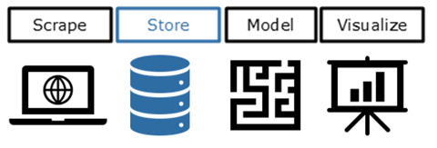
This article will deep dive into the process around storage of the data in order to achieve a user-friendly database. Sounds boring? Not at all! Read which steps we took to create our own meal delivery database.
As Data Analysts and Data Scientists, we generally work with data of relatively good quality from data marts or well-managed databases. However, this is not a given, so we wanted to explore which how to build pipelines ourselves. We will give more insights into the steps that leads from raw data to a ready to use data mart or database, such as mining source data, data transformation and creating a data mart. Furthermore, we will pay special attention to explaining the concept of Slowly Changing Dimensions.
A historic database with website data
We created a database in which scraped data from the website of the meal delivery service is collected. We make use of so-called Slowly Changing Dimensions, which enables us to track changes for each restaurant over time. With this method we can, for instance, see which new restaurants were added over time, which restaurants disappeared, what changed on the menu or sudden drops or increases in review ratings. Later in this article, we will explain Slowly Changing Dimensions in more detail.
As the overall quality of the data in our database is high and since we have used a smart data model, we are able to turn the data into value without much effort. More concrete, it makes it relatively easy to train our prediction models, build dashboards and do all types of fun analyses on our data set.
Fully in the Cloud
The data warehouse and all the tools we use are fully cloud-based. We work with two of the most widely used tools from Microsoft’s Azure suite: Azure Data Studio and Azure Data Factory.
Azure Data Factory offers a low-code way to visually implement all data transformation steps. This makes it an accessible tool for less technically educated people or analysts who prefer working using limited code. Azure Data Studio offers a SQL-environment in which we can connect to the database, comparable to SQL Server Management Studio.
A Journey through the layers of our Data warehouse
A data warehouse is a database in which data is processed and molded into a more usable form. This transformation of the data contributes to the user friendliness of the data. More specifically, it helps in answering recurring questions. Usually, this is achieved by processing the data through different ‘layers’. This way of processing allows to trace back how the raw data is transformed. In addition, it is common to organize the data according to a data model, so that the data is stored in the most efficient way for future use.
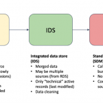
To go from a .json file to a fully working data model requires some data transformation steps inside the data warehouse. The image below shows the different steps or layers in the ETL-process. In our case the layers of the ETL-process involved the following steps:
- Staging (STG): in this layer we load the raw data from the scraper into the data warehouse.
- Raw Data Store (RDS): this layer keeps track of all changes to the data for each restaurant.
- Integrated Data Store (IDS): only unique and active rows of a restaurant are selected and obsolete data is not. This is a first step to data cleaning.
- Standard Data Model (SDM): used to create a data model out of all the data of previous steps (see image below).
- Data Mart (DM): contains the input data from the SDM, but it can also be used to add derived columns which are necessary for analyses or dashboards.
DWH Architecture:

Data model:

How we use Hash Algorithms for comparing differences in data
Hash algorithms help us to monitor changes at restaurants. A Hash algorithm converts certain input into a string with a fixed amount of characters. The input can be literally anything: 1 word, multiple words, or a full text. Whatever you use as input, the algorithm will always convert it into a string (or hash) of the same length. The length of this string depends on the algorithm you use.
As long as the input is exactly the same, the algorithm will always return the exact same hash. But if anything changes in your input, the returned hash will be completely different. See the table below for a simple example. If we change the input from ‘hallo’ to ‘Hallo’, the hash is a completely different string.
| Input | Hash value |
| hallo | d3751d33f9cd5049c4af2b462735457e4d3baf130bcbb87f389e349fbaeb20b9 |
| Hallo | 753692ec36adb4c794c973945eb2a99c1649703ea6f76bf259abb4fb838e013e |
The same principle can be applied to the data in our data model. We concatenate (‘merge’) all columns of one restaurant and use the algorithm to create a hash value. Whenever new data about a restaurant is provided from the scraper, we hash this new input as well. Subsequently, we compare the two hashes (so the old and new data). Are they the same? Then we can keep the old record and ignore the new restaurant info. Are the hashes not the same? Then the newest record becomes the most recent and we archive the old record.
| Restaurant_ID,Name,City | Hashvalue |
| R123456, Restaurant de Pauw, Bunnik | 753692ec36adb4c794c973945eb2a99c1649703ea6f76bf259abb4fb838e013e |
| R123456, Restaurant de Pauw, Amersfoort | e647ce62d0b158fd76f297c16727de4074495de17e096945280f996262a3e048 |
By saving the old record we can follow the full history of a restaurant. Each record contains the effective start date and end date between which it was active. This principle is called Slowly Changing Dimensions, since records only ‘slowly’ change over time. To illustrate, restaurants are not likely to change their name or address every day.
| Restaurant_ID | Name | City | Start_time | End_time | Recent |
| R123456 | Restaurant de Pauw | Bunnik | 2021-04-01 | 2021-10-01 | 0 |
| R123456 | Restaurant de Pauw | Amersfoort | 2021-10-01 | 9999-12-31 | 1 |
A result to be proud of
The end result is a data warehouse with ready-to-use data on which we can build analyses, models or dashboards. The data warehouse is built is such a way that new data can easily be added, and existing data can easily be archived. Thanks to Azure Data Factory, it is easy to see which transformations were applied and we can easily share the results with less tech savvy people. Moreover, the data model makes it easy to create new data marts.
Curious to see how we scraped the data we store here, read about that in this article.




Scraping data
Geplaatst op: september 30, 2022

Within Cmotions it is common that groups of colleagues work together on projects about topics of their interest in order to strengthen their expertise on those topics and to collaborate and learn from each other. These groups are called CIAs (Cmotions Interest Areas) and one of these groups has recently worked on a project about a meal delivery service.
Sometimes we come across data that inspires questions. As frequent customers of meal delivery services, we wondered about the questions we could answer if we had access to all the public data of one of these service providers. How many new restaurants were added to the website during covid? What would be the perfect place for a new sushi restaurant? And, to do ourselves a favor, where can we buy the best rated burger? In order to find answers to these questions, we needed to take all steps included in working with data: from storing the data, to building models and visualizing the data. However, it all starts with gathering data. Curious how we did this? Continue reading!
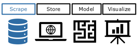
Nothing beats a clean set of data. Therefore, we initially contacted the company to access data through their API. Unfortunately, they had no resources available at the time, so we decided to scrape the data. This article will explain what we did in detail.
Note: scraping could be illegal, this depends amongst other things on the source and the reason why you gather the data and how you use it. Make sure you’re allowed to scrape the data for the reason you need it before you start!
The source
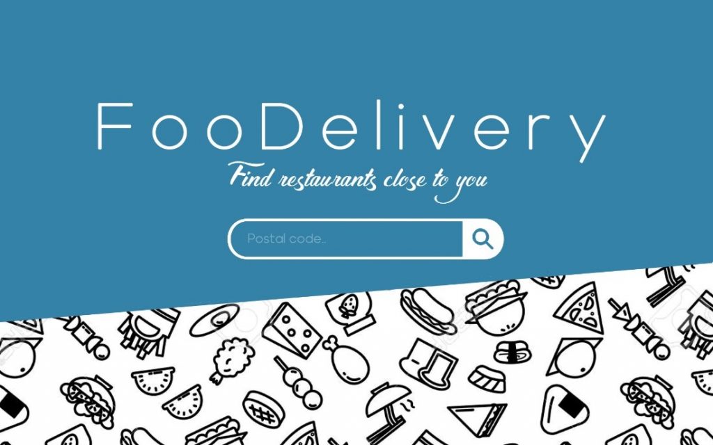
For those who are not familiar with meal delivery providers: on the website you can enter your postal code and subsequently it will show you a list of restaurants which are open to delivery in your area. On this page you can navigate to subpages that show you the menu and a list of reviews. In order to accommodate our many ideas for analyses, we scraped all three subpages for all postal codes in The Netherlands:
- restaurant names (including location)
- menus
- reviews
Obviously, in order to GDPR-proof our endeavor, we deleted all reviewer names.
What is webscraping?
Webscraping is a technique where software is used to extract information from webpages. We’ve built a bot that simulates human behaviour on a website: entering information, clicking, scrolling, etc.
How did we do it?

Tooling – Selenium and Python
The website was scraped using Selenium. This tool can be used to automate interactions on a webpage. Examples to think of are moving your mouse, clicking, navigating through pages, and downloading files. For this reason, it is a widely used tool for software testing, automating repetitive tasks and scraping websites. Selenium is available in several programming languages, we used the Python library.
The steps
After studying the structure of the site, the following steps were defined:
- Import a list of all postal codes in the Netherlands
- Scrape all restaurant information for each postal code
- Create a unique list of restaurant URL’s
- Fetch the menu for each restaurant
- Fetch all customer reviews for each restaurant
- Store all information in a data warehouse
Restaurants enter their delivery range in a list of 4-digit postal codes (whereas a complete Dutch postal code is 4 digits and 2 letters). To gather all restaurants, we need to enter all 4-digit postal code combinations on the website. We could have achieved this by trying to insert all 10.000 possible 4-digit combinations, but instead we only wanted to use the approximately 4.000 postal codes that actually exist. We used open data of Statistics Netherlands (CBS) for a list of postal codes of all households (January 2021). The data can easily be imported through the CBS own python package: cbsodata.
The results of steps 3, 4 and 5 are incrementally stored, so the scraper can be turned off and on (or break) without losing results.
Scraping: the technique
The selenium package is used to automate browser behavior using code. One of the options is to download the HTML code of a website. This is the same code you see when you right click on anything in your browser and choose ‘inspect element’. However, in most cases we were only interested in retrieving specific elements from the website (e.g., restaurant name, menu items, prices). This means that we want to look for small pieces of HTML which carry that useful information.
Browser -> Inspector
To give our browser tasks to retrieve information, we need to know which HTML corresponds to the elements of interest. We use the element inspector in our browser to manually find the HTML code we need. Open the website, search for an element of interest (e.g., the restaurant name) and right-click > inspect element. In the example below, we inspected one of the restaurants:

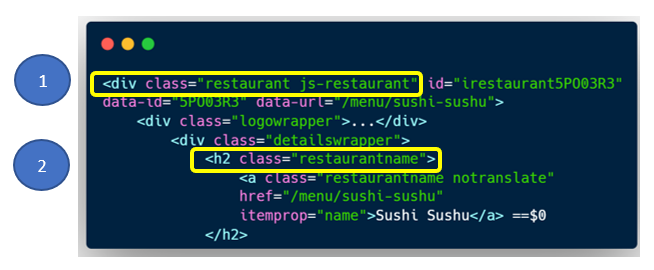
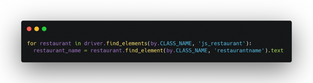
The indents show that there is a hierarchical structure in the HTML. On the top-level, you can see an element with classes ‘restaurant’ and ‘js-restaurant’ (1), both useful for selecting the element. In the subelement there is a class ‘restaurantname’ (2) where we find the title of the restaurant. With this information – the class names – we can identify the elements in Python and collect the names of all restaurants that are shown on the website. In Python, this looks as follows:
It takes time
To fetch all restaurants of one 4-digit postal code (start the browser, fill out postal code, fetch information, store information) the python script takes about 15 seconds. So, for 4.000 postal codes in the Netherlands, this took about 17 hours.
- Restaurants: 15 sec * 4.000 postal code4, a total of 17 hours
- Menus: 20 sec * 13.000 restaurants, a total of 72 hours
Although this takes quite some time, this is not an issue since this process can run in the background. Either way, improvements in code or helpful side doors on the website can lead to significant runtime reduction.
Website changed? Scraper breaks!
During the scraping of reviews, we noticed many errors. After investigation, it turned out that elements of the website had been reorganized. This meant that collecting the initially identified classes did not work properly anymore. Potential explanations for this problem are that the organization is updating the website in phases or performing A/B tests, which means that different versions of a website can be shown to the scraper.
Browser Inspector to the rescue
Fortunately, there is a solution to this problem. Apart from looking at the (HTML) code in the inspector, you can dive a level deeper into the code. To do this, you can navigate to the Network tab in the inspector and see which ‘requests’ are made.
As it turns out, you can find the API that the website itself uses to retrieve review information! This means we do not need to scrape the reviews from the website anymore, but we can directly approach the API to gather reviews.
Results
The scraping process creates four tables:
- All restaurants per postal code
- All reviews per restaurant
- All menus per restaurant
- The addresses and geo-location per restaurant (longitude and latitude)
These tables all together contain over 13.000 restaurants with about 7 million reviews spread out over 4.000 postal codes. Are you curious what is the best place to order a pizza in Utrecht? We know!
All data is stored in JSON format. How this raw data is subsequently processed to make it available for analyses in a database can be read in this article about storing the data.


Do you love Nachos? We know who you should talk to…
Geplaatst op: september 23, 2022

At the prime nachos location of The Netherlands, RDM Next, in the harbour of Rotterdam, the Cmotions and Analytics Lab Nachos hackathon was won by the fantastic cartel of DPG Media. They are the ones to watch when you’re thinking of setting up a rivalling nacho line. Even though the other cartels really put them to the test, they managed to stay focused, keep their people in line and made sure their network was relevant. Well done DPG Media!
During this hackathon the cartels needed their creative, visualization, analytics and modelling skills to setup the most successful nachos line from producing, transporting, and distributing nachos.
Curious what this looked like? Check out our aftermovie!
Thanks to Jan Persoon for this amazing video. And again a big thank you to our participating cartels, thanks to all of you this edition of our hackathon was a huge success again! So thanks to ABN Amro, ANWB, DELA, DPG Media, Lifetri, Rabobank, Underlined and UWV!

Nachos Hackathon 2022
Geplaatst op: september 6, 2022

We don’t know if you’ve heard already, but there is yet another crisis on our horizon: The Netherlands is in danger of becoming a nacho-state. The use of fried nacho chips in nightlife has become the rule rather than the exception. There is not a single South American cargo ship entering the harbour of Rotterdam that does not contain jalapeño peppers or sour cream hidden in banana boxes. Avocados are mashed into guacamole in secret Dutch cellars, making them easier to distribute all over Europe.

The police are in over their head unraveling the most exotic variants of this once innocent, triangle-shaped, corn product.
‘A small country is at the center of a billion-dollar Nachos industry.‘
Where some people see a crisis, we see an opportunity. One we wanted to share with our network. That is why we gathered some of the smartest people in The Netherlands to form their own cartels in our Cmotions and The Analytics Lab Nachos data & analytics Hackathon. Each participating cartel was challenged to set up an entire nachos line from producing, transporting, and distributing nachos.

We knew we invited some of the smartest people in The Netherlands, but still they managed to amaze us with all their creativity and spicy solutions. But as with everything, only one cartel can be the winner. For this years hackathon the fight was fierce, so we are very proud to announce that the fantastic data lovers from DPG Media were the ones who setup the most profitable nacho line.
Congratulations DPG Media!

Curious of what we did during the day, checkout our video!
We would like to thank all of our cartels for their enthusiastic participation, the hackathons are our favourite (work)day of the year, all because of you! We hope to see you all again for our next hackathon. And for the people who had to miss this one, let us know you’re interested and we will keep you updated on our plans for the next hackathon in 2023.
Hasta la próxima

Open SAS Enterprise Guide, PROC SQL, and then what?
Geplaatst op: juli 20, 2022

An article about three functionalities a newbie like me likes about SAS Enterprise Guide
Although I have found my way in the world of different scripting/ coding languages, like multiple SQL dialects, DAX and a bit of Python, I had never opened SAS Enterprise Guide (SAS EG from now on), until a few months ago. I had always been told that SAS was a dark world, a world with beasts that could only be tamed by true SAS experts. Those who had been discovering this world for several years (or those who had followed at least one training course in it). You can imagine my utmost delight when I learned that there was something like PROC SQL.
Now, six months after opening SAS EG for the first time, I am still very glad that PROC SQL exists, but I am actually impressed with SAS EG and glad that I learned to work with it.
So, open SAS EG, PROC SQL, and then what?
In this blog, I highlight three functionalities that I am quite excited about: Creating macros, making (cool) visualizations and performing simple models. I will briefly describe these functionalities and explain how I applied them. Disclaimer: No, I am not a SAS (EG) expert and you will not find a detailed elaboration on how the different functionalities work here. This, the SAS documentation can do a lot better. Use this article for inspiration. And yes, I will add the links to the SAS documentation.
Macros
Do you remember the good old macros within Excel? Well, SAS EG has something similar. In essence, a macro is a recorded number of steps you want to execute. Between %MACRO (start of macro) and %MEND (end of macro), you tell very precisely what the function should do when you will use it later. When you are building the macro you can include certain inputs as conditions, for example one or more variables, timestamps, numbers or text. Later, when you want to use the macro, you trigger it by writing %MACRO_NAME(), with the corresponding input between brackets.
You can now run the macro as many times as you want, with inputs as different as you want, without having to copy and adjust the entire script. Can you imagine…
- How much time you save if you want to change something in the script later?
- How easy it is to split up scripts? For example, to save on run time or to make the run more manageable?
- How easily and quickly you can run different models with different inputs?
- How much lines of code this saves? Which benefits readability of your scripts, reduced complexity and handover-time.
Practical example
In my current assignment in the finance sector, I work a lot with transaction data. Such rapidly increasing tables easily consist of tens of millions of rows. You can probably imagine that this can be a challenge in terms of run-time, when you want to use this data source or when you join it on a product or customer table. Especially if data management has set a maximum on runtime.
To avoid such issues at runtime, the script is rewritten into a macro, dividing the script into smaller time periods. Let’s call the macro %transaction_script(). In doing so, I do not specify a specific start and end date in the script, but instead refer to the conditions I pass along in the macro, e.g. begindate and enddate. Later, when I use the macro, I only need to specify the name of the macro, with associated conditions.
%MACRO transactions_script(timestampID,startdate,enddate);
PROC SQL;
CONNECT TO database_x();
EXECUTE BY database_x
(
CREATE TABLE database.schema.name_×tampID. AS
SELECT …
FROM …
…
DISTRIBUTE ON …
)
%MEND;
%MACRO transactions_script (TS1,'2019-01-01','2019-12-31');
%MACRO transactions_script (TS2,'2020-01-01','2020-12-31');
%MACRO transactions_script (TS3,'2021-01-01','2021-12-31'); Click here for more details on macros in the SAS documentation.
Visualizations
No, SAS EG is not my favorite visualization platform. I wouldn’t recommend it as a dashboard tool or as a feed for important presentations. Still, it can create rather nice visualizations, which can often come in handy. Think of quick explorations of your data or visualizing the output from your clustering model (I’ll come back to this later). It can be very helpful in understanding your data, detecting outliers and mapping your results. And the best of all is that anyone can visualize in SAS EG. Using simple statements, you create useful visuals that you can even customize to some degree.
Practical example
An example of when visualizing comes in very handy, is when interpreting a correlation matrix (PROC CORR). A correlation matrix without color quickly makes you dizzy, but when the values closer to -1 and +1 stand out, it suddenly becomes a very useful overview. Instead of exporting the results to a visualization tool or to Excel, you can also create a heat map in SAS EG. It may not work as easily, but once you have it set up properly, you can easily reuse it as often as you want.
Click here for the SAS documentation on visualizations.
Models
Finally, modelling in SAS EG. Even for creating relatively simple models, you don’t need to export your data from SAS EG to for example SAS Miner, or to another non-SAS tool. Analyses such as regression tests and cluster methods, which do not require turning too many specific buttons, are quickly created with simple statements.
Practical Example
After the previous paragraphs, it is no surprise that I used the clustering functionality in SAS EG. To be more precise, the K-Means Clustering method (FASTCLUS). I used this analysis to group the target population based on behavioral variables, after which I tried to give them meaning by linking the created clusters to more descriptive variables.
The clustering case is a nice example, as it makes use of the two previously described functionalities as well. From the cluster script I made a macro, with the number of K-Means clusters as a condition, e.g. %cluster_script(K). This allowed me to quickly generate, without taking up too much space in the script, the cluster outcomes of 2 to 10 cluster solutions.
%MACRO clustering_script(K);
PROC FASTCLUS
DATA=		work.data_set
OUT=		work.out&K.
OUTSTAT=	work.outstat&K.
MAXCLUSTERS=	&K.
MAXITER=	1000;
VAR=		variable1 variable2 variable3;
RUN;

PROC SQL;
CREATE TABLE work.clus&K. as (
SELECT		&K. as n_clust
		,max(case when _type_ = 'RSQ’ then over_all end)	as RSQ
		,max(case when _type_ = 'CCC’ then over_all end)	as CCC
		,max(case when _type_ = 'PSEUDO_F’ then over_all end)	as PSEUDO_F
FROM		work.outstat&K.
GROUP BY	n_clust;
RUN;

%MEND;
Then, these outcomes could be compared, to determine the best number for K. In making this decision, we were looking for the right balance of explaining additional variation and keeping the results implementable. This can be done using the RSQ, CCC and Pseudo-F outcomes. Which of course you can visualize in a nice line graph, with the explained variation on the Y-axis and the number of clusters on the X-clusters.

Click here for the SAS documentation on different models.
Not too long ago, I knew nothing about SAS EG and was a bit reluctant to work with it myself. However, SAS EG has surprised me in a positive way and has shown me some valuable features. If you’ve read on until here, I hope you’ve found the practical examples useful (or at least enjoyed reading the blog).

The statistics underlying the popmon hood
Geplaatst op: april 15, 2022

In our previous article we explain what model drift, concept drift and data drift is. Which we then put into practice in a notebook where we show you what you can do to make sure your productionized models keep working as expected with the help of popmon. Now it is time to complete the information, you need to get started using popmon to monitor model drift. If you haven’t read the previous articles, we strongly recommend reading them before reading this one. In this short article we’ll explain briefly and clearly what the most important things are that are happening under the hood in popmon.
Reference data
Popmon, which is short for population shift monitoring, is Python package developed by ING, read more on what they wrote about this themselves. This package helps you to be able to track the stability of your model features and predictions over time. There are traffic lights to alert you when something seems off. In popmon you can choose which reference period (the parameter references) you want to use to base your tracking on, the options are:
- ref: the reference data, a fixed dataset defined by the user,
- roll: a rolling window (last x time slots),
- prev1: the preceding time slot,
- expanding: all preceding time slots.
Using the given reference data, a comparison is made if the data in the new dataset is coming from the same distribution as was the case in the reference data. If a deviation is found, this can either lead to a yellow or a red traffic light, giving the severity of the deviation.
Comparisons and deviations
You probably wonder how these deviations are calculated/established. That is being done using different types of metrics:
- Profiles
- Comparisons of statistical tests
We will give a short description of each of the metrics, to give you some sense of all the calculations happening in the background when using popmon.
Profiles
- count: Number of entries (non-NaN and NaN),
- distinct: Number of distinct entries,
- filled: Number of non-missing entries (non-NaN),
- nan: Number of missing entries (NaN),
- overflow: Number of values larger than the maximum bin-edge of the histogram.,
- underflow: Number of values smaller than the minimum bin-edge of the histogram.,
- min: Minimum value,
- max: Maximum value,
- mean: Mean value,
- most_probable_value: Most probable value,
- std: Standard deviation,
- phik: phi-k correlation between the two variables of the histogram,
- phik_pvalue: p-value of the contingency test of the 2d histogram,
- phik_zscore: Z-score of the contingency test of the 2d histogram.
Comparisons
- ks: Kolmogorov-Smirnov test statistic comparing each time slot to {ref},
- ks_zscore: Z-score of the Kolmogorov-Smirnov test, comparing each time slot with {ref},
- ks_pvalue: p-value of the Kolmogorov-Smirnov test, comparing each time slot with {ref},
- pearson: Pearson correlation between each time slot and {ref},
- chi2: Chi-squared test statistic, comparing each time slot with {ref},
- chi2_norm: Normalized chi-squared statistic, comparing each time slot with {ref},
- chi2_pvalue: p-value of the chi-squared statistic, comparing each time slot with {ref},
- chi2_zscore: Z-score of the chi-squared statistic, comparing each time slot with {ref},
- chi2_max_residual: The largest absolute normalized residual (|chi|) observed in all bin pairs + (one histogram in a time slot and one in {ref}),
- chi2_spike_count: The number of normalized residuals of all bin pairs (one histogram in a time + slot and one in {ref}) with absolute value bigger than a given threshold (default: 7).,
- max_prob_diff: The largest absolute difference between all bin pairs of two normalized + histograms (one histogram in a time slot and one in {ref}),
- unknown_labels: Are categories observed in a given time slot that are not present in {ref}?
Traffic lights and alerts
Using the metrics mentioned above, the traffic lights are calculated based on the pull (calculated normalized residual) for each of the metrics. The traffic lights are then translated into alerts, which can be:
- green: mean no reason to think anything is deviating
- yellow: there seem(s) to be small deviation(s), might be good to check this/these columns
- red: there seem(s) to be large deviation(s), might be good to check this/these columns
The final report
If you want, popmon can create a profiling report or you can retrieve all the calculations and outcome in a dictionary. Both these outputs have the same sections, as we would expect after reading the information in this article:
- Profiles
- Comparisons
- Traffic Lights
- Alerts
Final remarks
We hope that this short, but sweet, overview will help you to have a bit more understanding of what is going on under the hood of popmon. Without reading our other two articles and playing around with popmon a little bit for yourself this article probably won’t help you a lot. So, do you feel lost after reading this? Don’t stay in the dark, but step into the popmon light and have some fun with monitoring your productionized models!
