Corporate identity graphs in Python
Do you recognize feeling frustrated about the looks of the standard Python graphs? Or you just need your corporate identity to be reflected in these graphs to be able to directly use them in a presentation? Well, I feel you! This is exactly the problem I ran into when happily working within my Python scripts and notebooks.
So, when my colleague Wouter van Gils showed me the corporate identity template he created for R, I decided to follow his lead and do exactly that for Python as well.
Luckily, this is actually quite straightforward in Python. We can create our own style by using the elaborate example that can be found in the matplotlib documentation. In my case I chose to only add the elements that I wanted to change and save the file as cmotions.mplstyle.
For me, the content of the file looks like this:
font.family : verdana
font.size : 8.0
xtick.labelsize : 10
ytick.labelsize : 10
axes.grid : False
axes.linewidth: 0.0
axes.prop_cycle : cycler('color', ['003D7C', 'F5A507','7C3F00','000000' ,'FFDC51','ACACAC', '1F77B4', 'FF7F0E', '2CA02C', 'D62728', '9467BD' , '8C564B', 'E377C2', '7F7F7F', 'BCBD22', '17BECF'])
xtick.bottom : False
ytick.left : False
legend.edgecolor : 1.0
legend.framealpha : 1.0
legend.frameon : False
legend.title_fontsize : 0.0
lines.linewidth : 3
axes.labelcolor : white
axes.titlesize : 20
axes.titleweight : bold
figure.figsize : 12, 12
Only thing I need to do before creating graphs is to add the following two lines of code to my script or notebook:
import matplotlib.pyplot as plt
plt.style.use('path_to_file/cmotions.mplstyle')
After running these lines my corporate identity theme will not only be used by matplotlib, but also when creating graphs using seaborn and pandas.
In the next code example you can see how I use my corporate identity style in Python.
# import packages
import pandas as pd
import matplotlib.pyplot as plt

# import your corporate identity styling
# in this case the mplstyle file is in the same folder as this notebook
# if this is not the case (which is probably the case), simply add the filepath to the filename
plt.style.use('cmotions.mplstyle')

# create an example dataset
df = pd.DataFrame({'category': ['cat1', 'cat1', 'cat1', 'cat2', 'cat2', 'cat2', 'cat3', 'cat3', 'cat3',
'cat4', 'cat4', 'cat4', 'cat5', 'cat5', 'cat5', 'cat6', 'cat6', 'cat6'],
'year': ['2018', '2019', '2020', '2018', '2019', '2020', '2018', '2019', '2020',
'2018', '2019', '2020', '2018', '2019', '2020', '2018', '2019', '2020'],
'value': [2,5,6,4,7,10,5,8,12,2,4,6,4,6,8,8,8,12]}, columns=['category', 'year', 'value'])

# line graph
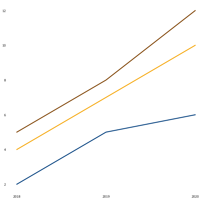
plt.plot('year', 'value', data=df[df.category=='cat1'])
plt.plot('year', 'value', data=df[df.category=='cat2'])
plt.plot('year', 'value', data=df[df.category=='cat3'])
plt.show()

# bargraph
plt.bar('category', 'value', data=df)
plt.show()

# before creating a stacked bar, we need to pivot our data
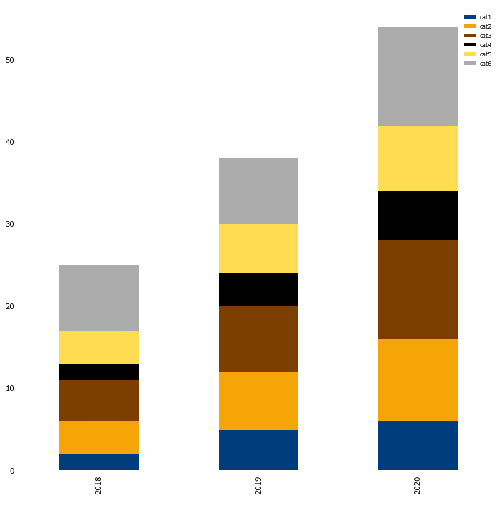
pivot_df = df.pivot(index='year', columns='category', values='value')

# stacked bargraph
pivot_df.plot.bar(stacked=True)
Of course more changes can be made, depending on your needs. I hope this basic example is useful to you when you want your corporate identity reflected in your Python output.
Enjoy creating your own corporate identity theme!


