Combine Google Maps and Choropleth shapefile
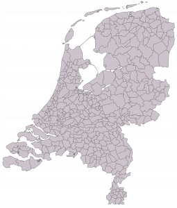
Sometimes the best way to visualize your information is by plotting it on an map. But what if the information you want to show isn’t a point on a map but a shape, like a neighbourhood? Well, that’s when you use a choropleth, which you can create using a shapefile (look for ESRI shapefiles on Google). Usually the map is still recognizable when you simply use the shapefile. For example, the shapefile of Holland looks like this:

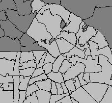
But when you zoom in on this map and, like I did, only want to visualize the postal code areas of Amsterdam. The map becomes unrecognizable and you have absolutely no clue of what you’re looking at:

For this reason I wanted to combine this choropleth with a Google Map plot of the same area. In this way you can still recognize the city of Amsterdam and it’s neighbourhoods.
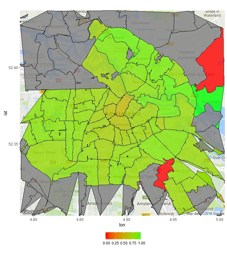
What I wanted to end up with was a heatmap, which showed the “intensity” for each neighbourhood of Amsterdam. In this case, the “intensity” showed was the conversion percentage of a campaign that was done in Amsterdam.
For this purpose we’ll need the following packages: ggmap, RgoogleMaps, maptools, rgdal, ggplot2, rgeos. So we’ll start by loading these packages.
# install and load packages
library(ggmap)
library(RgoogleMaps)
library(maptools)
library(rgdal)
library(ggplot2)
library(rgeos)
Now that we have loaded all the necessary packages, we’ll move on by gathering the Google Maps view we need to plot the choropleth on. There are two ways to use the geocode function (ggmap package) to get the coordinates we want to use as the center of the map, either you use the name of the location or you just enter the coordinates yourself:
# get the coordinates of the center of the map you want to show
 CenterOfMap <- geocode("Amsterdam")
 CenterOfMap <- geocode("52.374,4.618")
You can use these coordinates to tell the get_map function (ggmap package), which part of the world you’re looking for. With the zoom variable you can define the area you want to see.
# get the map from google
Amsterdam <- get_map(c(lon = CenterOfMap$lon, lat = CenterOfMap$lat),zoom = 12, maptype = "terrain", source = "google")
Make sure you’ve downloaded the correct area of the world with the right zoom level.
# create and plot the map
AmsterdamMap <- ggmap(Amsterdam)
AmsterdamMap
Now we’ve got the map we can start with loading the data we want to show on the map.
# load the data you want to show in the choropleth
geo_data <- read.csv("Data.csv", header = T, sep = ";", dec = ",")
This dataset contains two columns:
- id, which contains the four digits of the Dutch postal codes;
- value, which contains the value I want to show on the map, in this case this is the conversion rate for each area.
Finally, we need to load the shapefile of Holland with the four digit postal areas. In order for Google to recognize the latitude and longitude of the shapefile we need to transform it.
# load the shapefile
shapedata <- readOGR('.', "ESRI-PC4-2015R1")
# transform the shapefile to something Google Maps can recognize
shapedata_trans <- spTransform(shapedata, CRS("+proj=longlat +datum=WGS84"))
After having done this, we’re ready to combine all our files to create one stunning plot! We start by merging the shapefile with the data we want to plot.
# add an id to each row
shapedata_trans@data$id <- rownames(shapedata_trans@data)
# merge the data and the shapefile
shape_and_data <- merge(x = shapedata_trans, y = geo_data, by.x = "PC4", by.y = "id")
In merging these files it can happen that self-intersections arise, we want to make sure to remove them, since they’ll cause errors.
# repair self-intersections
shape_and_data_wsi <- gBuffer(shape_and_data, width = 0, byid = TRUE)
Lastly, we fortify the combination of the data and the shapefile and combine the resulting data with the original shapefile.
# fortify the shapefile to make it usable to plot on Google Maps
fort <- fortify(shape_and_data_wsi)
# merge the fortified shapefile with the original shapefile data
PC4 <- merge(fort,shape_and_data_wsi@data, by = "id")
We end up with a file we can combine with our Google Map plot we’ve created earlier.
# create the final map with the overlaying choropleth
AmsterdamMap_final <- AmsterdamMap +
  geom_polygon(aes(x = long, y = lat, group = group, fill = value), size = .2, color = 'black', data = PC4, alpha = 0.8) +
  coord_map() +
  scale_fill_gradient(low = "red", high = "green") +
  theme(legend.title = element_blank(), legend.position = "bottom")
AmsterdamMap_final
Which in the end leads us to this plot:


